Parkies Are Freaks

Category
Additional Images
Sub Categories
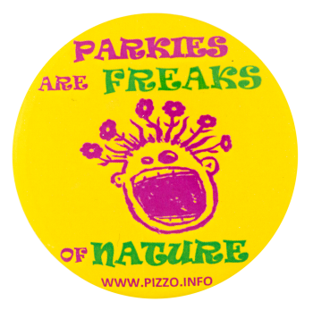
Text on Button PARKIES ARE FREAKS OF NATURE WWW.PIZZO.INFO
Image Description

A purple illustration of a face with a big open mouth smile and flowers for hair on a yellow background with purple and green text on the top and bottom

Back Style
The Shape
The Size
Additional Information

Established in 1988, Pizzo & Associates, Ltd. is an Ecological Restoration contracting firm that handles natural areas and sustainable landscapes projects across the Midwest.

Catalog ID AD0115

I've Got Oomph

Category
Additional Images
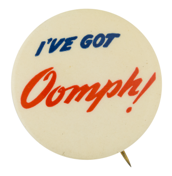
Text on Button I've GOT Oomph!
Image Description

White background with blue text on top and red text on the bottom

Back Paper / Back Info

Eat the bread with Oomph! Phone Humboldt 3-2540. Linden 2-3370. Orange 3-0646. and Rice's Bread the bread with Oomph! Will be delivered to your home

Back Style
The Shape
The Size
Additional Information

"I've got oomph!" is an advertising slogan used by Rice's Bread, a restaurant started in 1930s. Rice's Bread ads can be seen in the Afro American Newspaper in the 1940s. Besides meaning a sound made under exertion, “Oomph” is also a colloquial term for sex appeal and attractiveness. Although the first spotted use was in the 1900s in the U.S., "oomph" did not become a popular term till 1930s, and became accepted as a "proper English word" in a London newspaper in 1946. 

Catalog ID AD0118

First Class Legs

Category
Additional Images
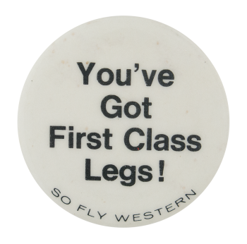
Text on Button You've Got First Class Legs! SO FLY WESTERN
Image Description

White background with black text

Back Style
The Shape
The Size
Additional Information

This is a promotional for Western Airlines, likely from the 1970s. The airlines boasted that all passengers, whether in First Class or Coach, had the same amount of legroom. Beginning in 1925 as an airmail delivery company, it was finally bought out by Delta Airlines in 1987.  

Catalog ID AD0119

Cleveland Indians

Category
Additional Images
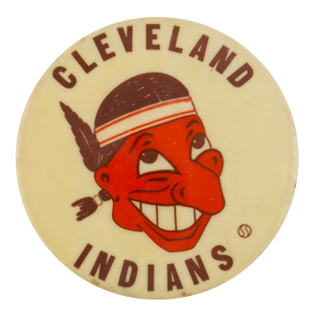
Text on Button CLEVELAND INDIANS
Image Description

A man with a red face, brown hair, and headband with a brown feather. Brown text on top and bottom portion of button. Illustration and text lies on a white background. 

Back Style
The Shape
The Size
Additional Information

Though existing for many years prior, in 1915 the modern Cleveland Indians baseball team was formed. The first documented use of a Native American chief as their mascot occurred in 1928, this general depiction was redesigned in 1929, 1933, and 1939 and remained in use until it was decided in 1946 that the logo needed to be changed. It was at that point when this caricature, later named Chief Wahoo, was adopted by the team. The logo was designed by 17 year old Walter Goldbach.  This particular image was in use from 1946 to 1950 when it was changed to the modern depiction of Chief Wahoo.

There is some controversy surrounding the logo, many feel that it is racially insensitive and should be changed while others feel that it is honoring Louis Sockalexis, the first Native American professional baseball player. Sockalexis played for Cleveland during the 1897-1899 seasons. There is some debate over the accuracy of Sockalexis being the source of the name at all, given it was adopted 16 years after his short career ended. Currently the modern version of Chief Wahoo is still in use by the team.

Catalog ID SP0005

Clarion Fights

Category
Additional Images
Text on Button CLARION FIGHTS
Image Description

Two black stripes on the top and bottom with one large red stripe in the middle. The red stripe contains the words "Clarion Fights" which are in bold black letters. 

Back Style
The Shape
The Size
Additional Information

Have info on this button? Contact us here.

Catalog ID SP0022

Cincinnati Reds

Category
Additional Images
Sub Categories
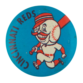
Text on Button Cincinnati Reds
Image Description

Black text on a blue background with a baseball head on a body running with a red bat.

Curl Text ADV. PREMIUM SALES - ST. LOUIS, MO
Back Style
The Shape
The Size
The Manufacturer
Additional Information

Established in 1881, the Cincinnati Reds are a Major League Baseball team based in Cincinnati, Ohio and members of the National League Central Division.  The original logo consisted of the word “REDS” inside a wishbone “C” on a red and white color scheme.  During the 1950s, the Reds went through renaming and rebranding of the team as the Cincinnati Redlegs to avoid connections to the communist term ‘Reds.’   They added in the color blue along with their mascot Mr. Redlegs, a humanoid figure in a Reds uniform and an oversized baseball for a head with a large handlebar mustache. 

Catalog ID SP0015

Chicago Cubs

Category
Additional Images
Sub Categories
Text on Button CUBS TM
Image Description

A blue background with white and red stripes crossing the middle horizontally. In the center is a blue circle with another white circle in that. In the white circle is red and blue text

Curl Text MADE IN USA BY ASCO, WINONA, MN 55987
Back Style
The Shape
The Size
Additional Information

One of the oldest sports franchises in US history, the Chicago Cubs have been continually playing in the same city since 1870. Their logo has changed many times over the year, starting as a Old English C. The C shape changed several times over the years, sometimes represented with a bear or 'ubs' inside the C to create the team name. This logo came into use in 1979 when a thicker blue circle was introduced to replace the thin blue circle that was used from 1957-1978.  

Read more about the History of Cubs Buttons on the Busy Beaver blog.

Catalog ID CH0147

Chicago Blackhawks Logo

Category
Additional Images
Sub Categories
Image Description

A white background featuring the Chicago Blackhawks logo, a profile of a face with black hair, war paint, and red, green, yellow, and orange feathers

Back Style
The Shape
The Size
Additional Information

One of the original 6 National Hockey League teams, the Blackhawks (spelled Black Hawks prior to 1986) have won a total of 5 Stanley Cups since their creation in 1926, with the 5th win in the 2012/13 season. The Blackhawks logo has stayed very similar over the years. In the beginning it was black and white, then a colored face with a black background surrounded by a large circle with the words "Black Hawks Chicago" inside the ring. In 1941 the first generation of the current logo was introduced. Over the years the picture of the Native American brave changed, in 1955 the feathers were colored in, his skin became lighter. In 1965 the outer ring was dropped from the logo, leaving just the face. Since 1965 the logo has not changed much beyond the facial features becoming softer, a less sloping forehead and smaller nose, as well as the skin becoming darker and less yellow.

Over the past few years, the logo has been assessed for its representation of Native peoples. The team consulted with the American Indian Center of Chicago in 2013 where they came to the conclusion that because the logo depicts a famous Illinois native--Chief Blackhawk--it can be seen as honoring a man rather than pushing stereotypes about Native Americans. 

Sources

Blackhawks Avoid Backlash — For Now — by Engaging Native American Community. (n.d.). NBC Chicago. Retrieved August 11, 2022, from https://www.nbcchicago.com/news/sports/blackhawks-making-effort-to-enga…

T. H. W. Archives. (2022, April 8). Chicago Blackhawks Logo History. The Hockey Writers. https://thehockeywriters.com/chicago-blackhawks-logo-history/
 

Catalog ID CH0142

Chicago Bears Helmet

Category
Additional Images
Sub Categories
Text on Button Chicago Bears
Image Description

Blue text on a white background with two blue horizontal lines and one orange horizontal line with a blue football helmet with an orange C.

Back Style
The Shape
The Size
Additional Information

One of only 2 teams left from the founding members of the National Football League, the Chicago Bears (formerly the Decatur Staleys 1919-1921) logo has remained fairly steady over their 96 year history. Keeping their colours of blue, orange and white from the earliest days, the blue helmet base colour has been in place continually since the 1936 season. Adopting a solid white wishbone shaped C as their logo in 1962, in 1973 it changed to the logo we know today, an orange C bordered in white.

From 1982-2011, the helmets were blue with the orange and white C and a blue face mask. Prior to 1982, the facemask was silver. After 2011, the face mask changed designs and no longer had the swooping dip to protect the ears and jaw, adopting a straighter line.

Catalog ID CH0144

Beat Schurz

Category
Additional Images
Text on Button BEAT SCHURZ
Image Description

Green text on a yellow background

Curl Text Geo. Lauterer Corp. Chicago, Ill 60360
Back Style
The Shape
The Size
The Manufacturer
Additional Information

Lane Technical College Prep High School located in Chicago, Illinois, was founded in 1908. The campus has an enrollment of just over 4,000 students, grades 7-12. Lane Tech's colors are green and gold, and their mascot is the Indians (which has been much debated in recent years, but still remains unchanged).

One of Lane Tech's biggest rivals, Carl Schurz High School, also located in Chicago, was founded in 1910. It was designed by Dwight H. Perkins and designated a Chicago Landmark on December 7, 1979. Schurz is a public high school with an enrollment of about 2,500 students. Schurz's colors are purple and gold, and their mascot is the Bulldog. 

This button is in Lane Tech's colors, green and gold, to support the Indians in their game against the Schurz Bulldogs.

Catalog ID CH0169