Phil Hale WKNB

Category
Additional Images
Sub Categories
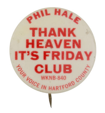
Text on Button PHIL HALE THANK HEAVEN IT'S FRIDAY CLUB WKNB-840 YOUR VOICE IN HARTFORD COUNTY
Image Description

Red text on a white background.

Back Style
The Shape
The Size
Additional Information

WKNB first came on air for the first time on August 18, 1946.  With call letters standing for Kensington-New Britain, the station served the area around Hartford, Connecticut.  One announcer which served the station in the late 1950’s and early 1960’s was Phil Hale.  Hale’s program often filled the early morning time slot.  By 1962, the station’s callsign had changed to WRYM.

Catalog ID CL0171

Basil Wolverton Peace Corps

Category
Additional Images
Sub Categories
Text on Button PEACE CORPS
Image Description

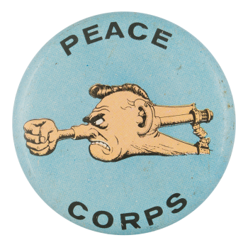
Illustration of a head with a fist coming out of the nose on a light blue background. Text above and below the illustration.

Curl Text Made in Japan
Back Style
The Shape
The Size
Year / Decade Made
Additional Information

The 1965 series of LEAF "Fink Buttons" were illustrated by popular Mid-Century artist Basil Wolverton. Perhaps best known for his work at MAD Magazine, Basil Wolverton (July 9, 1909 – December 31, 1978) was an American cartoonist and illustrator famous for his humorously grotesque drawings. Wolverton worked in the "Golden Age" of comic books doing features like "Powerhouse Pepper" and "Spacehawk" in the 1940s. A 2009 New York Times article states that Wolverton’s drawings embodied the “sick-and-proud humor” of MAD magazine and were considered a “virtuoso exercise in bad taste, made all the weirder for being so meticulously executed."

Catalog ID AR0074

Out For A Wild Time

Category
Additional Images
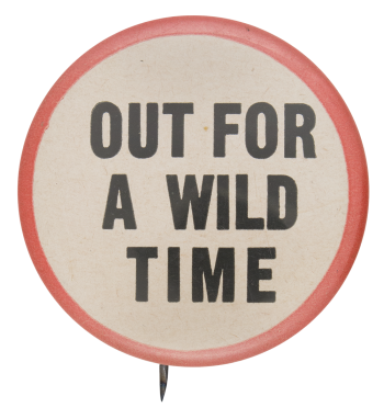
Text on Button OUR FOR A WILD TIME
Image Description

Black text on an off-white background encircled by a red border. 

Back Style
The Shape
The Size
Additional Information

The phrase "out for a wild time" typically means that someone wants to show a lack of restraint and have no inhibitions. It is often said when one is going for a night out on the town or having some other fun occasion. This saying, which likely became popular in the mid-twentieth century, is still used today. 

Sources

McGinnis, J. (n.d.). Out for a wild time. Pinterest. https://www.pinterest.com/pin/116671446580740422/

Catalog ID IB0329

Ottawa Ski Club

Category
Additional Images
Sub Categories
Text on Button OTTAWA SKI CLUB 1949
Image Description

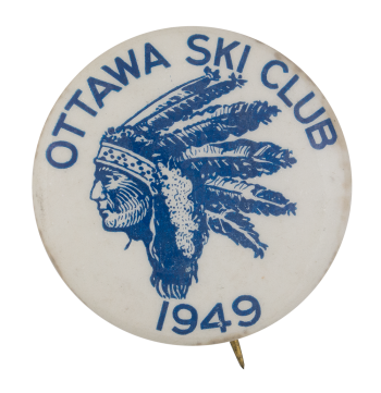
Blue illustration of a profile view of a person in a Native American feathered headdress with blue text above and below on a white background.

Back Paper / Back Info

ST. LOUIS MO ST LOUIS BUTTON CO. (repeated over and over)

Back Style
The Shape
The Size
Additional Information

The Ottawa Ski Club was founded in 1910 by a group of ski jumpers. They set up jumps in Rockliffe Park to begin with. Ski jumpers, unlike pleasure skiers were in need of a club where they could build towers and jumps. The popularity of ski jumping continued to grow and during World War I the club raised a lot of money jumping for the Red Cross. The tower was knocked down by weather in 1915, but the club reorganized in 1919. The new club members began promoting pleasure skiing, long distance outings, racing, etc. they did not want to just be known for ski jumping. As the club grew they invested in shelters and lodges throughout the Gatineau park. The club also continued to groom and clean trails. The Ottawa Ski Club was extremely influential in bringing skiing sports to thousands of people. The ski club also published newsletters as a way of reaching their members.


Mortureux, C. E. (1942). “The Saga of the Ottawa Ski Club.” Ottawa Ski Club Handbook. 2-9.

Catalog ID CL0146

Abstract Art Three

Category
Additional Images
Sub Categories
Image Description

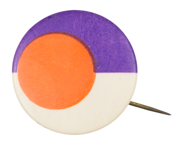
Half the button has a white background and the other half is purple. There is an orange circle on one side overlapping both background colors.

Back Paper / Back Info

GO SUPER
GO MLLE

N.G. SLATER CORP. NYC

Curl Text N.G. SLATER CORP. NYC 11
Back Style
The Shape
The Size
The Manufacturer
Additional Information

Have info on this button? Contact us here.

Catalog ID AR0145

Orange and Black Face

Category
Additional Images
Sub Categories
Image Description

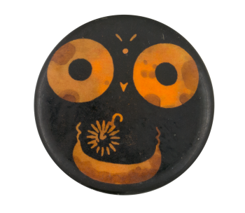
Image of a face with orange large eyes, a mouth, and eyebrows on a black background.

Back Style
The Shape
The Size
Additional Information

Have info on this button? Contact us here.

The classic yellow smiley face is comprised of a yellow circle, two black dots for eyes, and a black arc ending in serifs for a mouth. It was designed in 1963 by commercial artist, Harvey Ross Ball. Ball was commissioned by The State Mutual Life Insurance Company to create a happy face to raise the morale of their employees. His version was created in 10 minutes. The design was printed onto more than 50 million buttons. Neither Ball nor the company copyrighted this smiley, so it was continually used by other businesses in their promotions.
The design and concept is quite simple and was definitely used before Ball’s 1963 version. However, his has become the most iconic. Variations have been used for advertising campaigns and in popular culture ever since.

Sources

About Harvey Ball. (n.d.). Retrieved September 12, 2020, from https://www.worldsmileday.com/index.php/article-index/item/380-about-ha…

Catalog ID SM0021

Oil Wagon Drivers Chauffeurs & Filling

Category
Additional Images
Sub Categories
Text on Button Oil Wagon Drivers Chauffeurs & Filling Station Employees 705 March 1940 AF. OF L. I. B. OF T. C. S. & A. OF A.
Image Description

Light green text on dark green background around the outer edge of the button with a light green inner circle with dark green text. There is a white banner across the middle with dark green text on it. 

Back Paper / Back Info

GREENDUCK CO. CHICAGO
PAT FEB 13 1917
image of a duck
union bug

Back Style
The Shape
The Size
Year / Decade Made
The Manufacturer
Additional Information

Oil Wagon Drivers, Chauffeurs, & Filling Station Employees, Local 705, was a Chicago union affiliated within the International Brotherhood of Teamsters, Chauffeurs, Stablemen and Helpers of America and American Federation of Labor. After 1940, the International Brotherhood of Teamsters, Chauffeurs, Stablemen and Helpers of America changed its name to the International Brotherhood of Teamsters, Chauffeurs, Warehousemen and Helpers of America and is currently known as the International Brotherhood of Teamsters.  By the 1940s, the union, especially Local 705, was considered the most abusive and corrupt unions in the US.

Catalog ID CL0267

Official Falsie Inspector

Category
Additional Images
Sub Categories
Text on Button OFFICIAL FALSIE INSPECTOR
Image Description

White text on a green and red badge over a white background. 

Curl Text JAPAN
Back Style
The Shape
The Size
The Manufacturer
Additional Information

Falsies are paddings used to create the look of larger breasts and despite this method being used for quite some time, the term “falsies” didn’t really become popular until the late 1950s. It was also around this time that breast implants became an option as well. As a “humorous” joke, these Official Falsie Inspector buttons were created in the 1960s and anyone who wore the button was believed to be an official inspector on whether or not females had real breasts.  

Sources

Bowes, C., & Hebblethwaite, C. (2012). A Brief History of Breast Enlargements. Retrieved from https://www.bbc.com/news/magazine-17511491

Catalog ID IB0330

10th Annual Picnic Oakwood O.K. Club

Category
Additional Images
Sub Categories
Text on Button 10th ANNUAL PICNIC OAKWOOD O.K. CLUB SOUVENIR AUGUST 25, 1910
Image Description

Illustration of a green leaf in the center with green text along the outer edge of the button, on a white background. 

Back Paper / Back Info

BASTIAN BROS. CO. 
MFRS OF RIBBON, METAL AND CELLULOID NOVELTIES
ROCHESTER, N.Y.

Back Style
The Shape
The Size
The Manufacturer
Additional Information

The Oakwood OK Club was a social club located in Oakwood, New York. The Oakwood OK club sponsored an annual picnic for the benefit of the local community. The picnic featured entertainment as well as refreshments.

Sources

Gala Oakwood Picnic Set For August 24th At Grove. (1938, August 11).The Citizen Advertiser.

Catalog ID EV0090

Tony Fitzpatrick’s No. 9

Category
Sub Categories
Text on Button No. 9
Image Description

White background with various illustrations and images all over it (butterfly, cat-headed person in a tie riding a scooter, elephant-headed person in a dress, Christmas string lights etc). There is a large illustartion of a green and white bird perched on a brown branch in the middle of the button.

Back Style
The Shape
The Size
Additional Information

This image of a bird and very prominent “No. 9” is part of Tony Fitzpatrick’s collection of etchings by that title. Tony Fitzpatrick is a Chicago based artist who began his art career in the 1980s drawing with colored pencils in a store front gallery in Villa Park, Illinois. This collection, No. 9, was reviewed in the Austin Chronicle in December of 2009. The reviewer, Wayne Brenner, said the following about the collection, "This art is spectacular in its meticulous arrangements of images – birds, women, snakes, flowers, cityscapes – and the borrowed texts adhered. The works feature a central figure surrounded by smaller figures and sharp typography, the whole thing as busy as a galaxy of information without being cluttered, offering an idea of what holy file-drawer labels might look like in the main warehouse (carved from pure crystal, illuminated by some energy within) of some God of Memory."

The full title of this collection is “No. 9, An Artist’s Journal” as the inspiration for the etchings all came from the daily musings and experiences of Tony throughout his life. His pieces were also inspired by his surroundings while in Tokyo, Chicago, and New Orleans.

Sources

Brenner, W.A. (2009, December 4). Tony Fitzpatrick: No. 9, an artist’s journal. The Austin Chronicle. Retrieved from: http://www.austinchronicle.com/arts/2009-12-04/924560/

Catalog ID AR0090