| Information |
The Philadelphia High Schools had a tradition of picking an "unofficial" mascot for each graduating class. Simon Gratz High School chose the comic strip character Myrtle as their class mascot. Button was issued for the graduating class of June 1945. This was the first time that particular high school had selected a class mascot and joined all the other public high schools in the tradition. Issued in the school colors of red and white this button say limited production and was available only to members of the graduating class. A bit unusual as the nam |
|---|---|
| Button Image |
Safe Zone Ally

| Category | |
|---|---|
| Additional Images |

|
| Sub Categories | |
| Text on Button | Sonoma State Safe Zone Ally . Gay Lesbian Bisexual Transgender & Questioning |
| Image Description | White background with an off white ring around the outside. In the center is an upside-down pink triangle. All font is black. Above the triangle reads “Sonoma State”, in the triangle reads “Safe Zone,” and diagonally at the bottom in a different font reads, “ally.” Around the outside of the button reads, “Gay Lesbian Bisexual Transgender & Questioning” with a dot at the end. |
| Back Style | |
| The Shape | |
| The Size | |
| Additional Information | The HUB cultural center at Sonoma State University is a student support space that seeks to foster connections and build community on campus. Their programming focuses on inclusivity and equality, with much of their work engaging with gender and sexuality. The concept of a “safe zone” is a space (physical or metaphorical) where conversations are met with care and support. On many college campuses, staff and students undergo some “safe zone” training and then wear visuals like buttons or stickers to indicate that they are open to engaging in supportive conversations – specifically around LGBTQIA+ topics. The upside-down pink equilateral triangle is a symbol for various LGBTQIA+ identities. It was originally used by the Nazi regime as a visual cue for stigmatization of homosexual concentration camp prisoners. However, in the 1970s, it was revived and reclaimed by gay rights activists. This reclamation was met with some trepidation until the AIDS epidemic hit. In 1987, ACT UP chose to invert the triangle, so it faced upward, becoming a powerful visual symbol of pride and resilience in the face of horrendous persecution. More contemporarily, the pink triangle can be seen at protests and pride parades, on a range of materials. |
| Sources |
Plant, R. (1986). The Pink Triangle: The Nazi War Against Homosexuals. Retrieved November 6, 2020, from https://books.google.ca/books/about/The_Pink_Triangle.html?id=oQeradc0p…. Sonoma State University. (n.d.). The HUB Home. Sonoma State University. Retrieved November 6, 2020, from http://hub.sonoma.edu/. Waxman, O. B. (2018, May 31). How the Nazi Regime's Pink Triangle Symbol Was Repurposed for LGBTQ Pride. Time. Retrieved November 6, 2020, from https://time.com/5295476/gay-pride-pink-triangle-history/. |
| Catalog ID | SC0055 |
Powderpuff Pilot

| Category | |
|---|---|
| Additional Images |

|
| Sub Categories | |
| Text on Button | Silly Boys, Airplanes are for GIRLS! www.powderpuffpilot.com |
| Image Description | White and black text on bright pink background. "Girls!" is in black while all other text is white. Curved along the bottom of the front face is white text for the website. |
| Back Style | |
| The Shape | |
| The Size | |
| Additional Information | The Powder Puff Pilot brand has been selling merchandise catering to female pilots for around ten years. The spark that started the company came from Sue and Dale Hughes’s child. The couple’s eight-year-old daughter, who was interested in flying, asked if aviation logbooks came in pink. Due to the fact that ninety-four percent of aviators are men, logbooks and other merchandise usually come in more masculine colors and designs. There were not any pink logbooks. Sue Hughes, one of the owners of Powder Puff Pilot, discussed the discrepancy in merchandise, and she found great support among female pilot friends for aviator merchandise targeting women. The inspiration for the brand name came from Will Rogers who referred to the Women’s Air Derby, a transcontinental air race, as the “Powder Puff Derby.” "Silly boys, airplanes are for girls," is a word play on the well-known slogan, "Silly rabbit, Trix are for kids!” from General Mills Trix cereal. |
| Sources |
Hughes, S. (n.d.). Powder Puff Pilot - About Us. Internet Archive Wayback Machine: Powder Puff Pilots. https://web.archive.org/web/20190106034534/http://www.powderpuffpilot.c… |
| Catalog ID | AD1015 |
Reading is Doctor-Recommended

| Category | |
|---|---|
| Additional Images |

|
| Sub Categories | |
| Text on Button | Reading is doctor-recommended ASK ME WHY! |
| Image Description | Blue background with white and yellow text with red graphic. |
| Curl Text | www,reachoutandread.org |
| Back Style | |
| The Shape | |
| The Size | |
| Additional Information | Reach Out and Read is a non-profit program founded in 1989 to encourage daily reading to young children. Under this initiative, pediatricians supply new parents with books during regular check-ups in an effort to get them to read aloud to their kids. Knowing the positive benefits reading can impart to small children, healthcare professionals are striving to lay the foundations of success early on through literacy. Over the last three decades, more than 34,000 medical personnel have participated in Reach Out and Read helping to distribute 7.4 million books to 4.8 million children every year. The program was started by a group of pediatricians and educators from the Boston Medical Center and made reading aloud a doctor-recommended activity. The program empowers families to integrate storytelling in their daily routines and prioritize early childhood literacy. Evidence put out by the American Academy of Pediatrics in 2014 indicates that reading from a young age improves parent-child interactions and promotes socio-emotional development. Former First Lady and librarian Laura Bush has also expressed support for the program. |
| Sources |
Reach Out and Read. (n.d.). About. https://www.reachoutandread.org/about/ |
| Catalog ID | CA0827 |
US

| Category | |
|---|---|
| Additional Images |

|
| Text on Button | US |
| Image Description | Black background with gray text. |
| Back Style | |
| The Shape | |
| Additional Information | Have info on this button? Contact us here. |
| Catalog ID | EV0915 |
Whitehead & Hoag Company
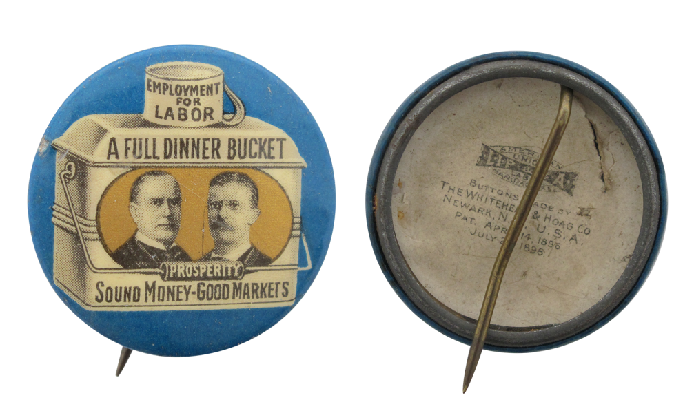
The Whitehead & Hoag company was formed in 1892 in Newark, New Jersey, as a partnership between printer Benjamin S. Whitehead and paper merchant Chester R. Hoag. It soon became the largest manufacturer of novelty advertising in the United States, eventually making over 5,000 different items. In the late 1890s, the company had branch offices across the U.S.
Parisian Novelty Co.
Parisian Novelty Company was the oldest button manufacturer in Chicago. Founded in 1898 by Louis L. Joseph, the company was a leading manufacturer of button parts, button-making machinery and equipment in North America.
Green Duck Button Company
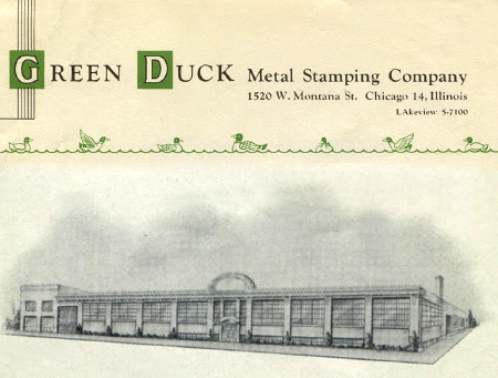
The Green Duck Co. was founded in Chicago in 1906 by George G. Greenburg and Harvey Ducgheisel. The "Greenduck" name was taken from the first syllables of their last names and was meant to be one word, but people tended to use it as two words, so the company became the Green Duck Metal Stamping Co. It produced various metal items such as license plates, tokens, clickers, watch fobs, and lithographed buttons.
J.L. Lynch
In 1909, James L. Lynch retired from his various roles and duties as an officer with division 260 of the Chicago Streetcar Workers Union to enter the business as a sheet metal industrialist and producer of union badges, banners, and buttons. His early endeavors focused on “…all supplies used by labor organizations and fraternal societies”, with his first manufacturing business being located at 108 E. Washington Street in Chicago.
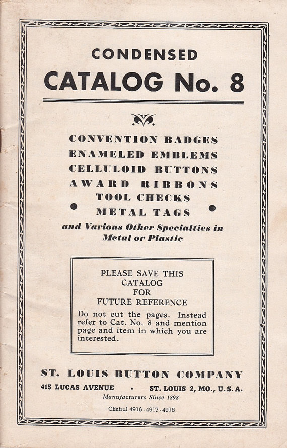
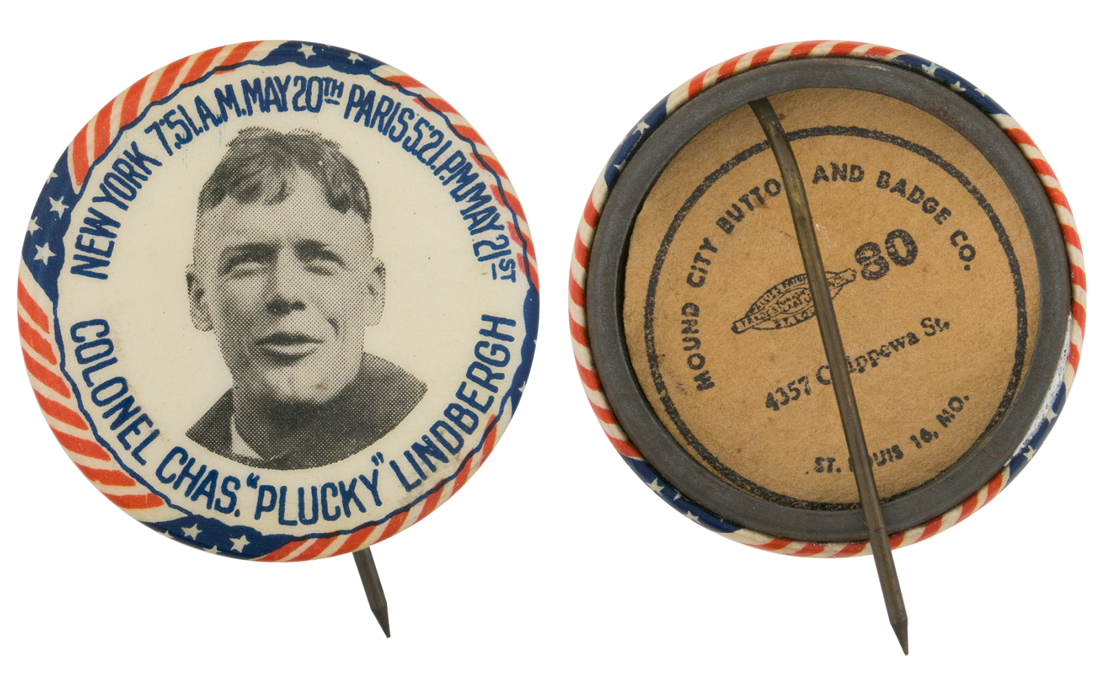
St. Louis Button Company
 Little Giant Button Machine," which made buttons from one-half inch to 3 1/2 inches in diameter.