I Love McDonald's

Category
Additional Images
Sub Categories
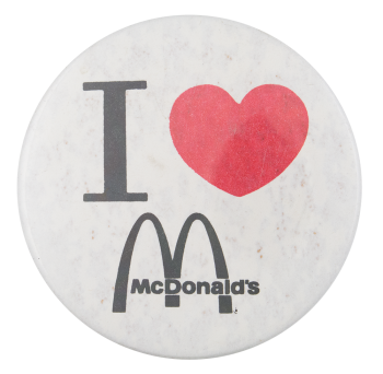
Text on Button I ♥ McDonald's
Image Description

Black text and red heart on white background.

Back Paper / Back Info

engraving: Badge -A- Minit LaSalle ILL 61301

Back Style
The Shape
The Size
Additional Information

The first McDonald's restaurant - "McDonald's Bar-B-Q" - was established by brothers Maurice and Richard McDonald in 1940 in San Bernardino, California.  After realizing that hamburgers were the product that made them the most profit, the brothers perfected a streamlined assembly line system in their restaurant to sell a simple menu of burgers, fries, drinks and apple pie and in 1948, changed the name of the restaurant to simply "McDonald's".

The McDonald brothers began to franchise their business in 1953 but it wasn't until Ray Kroc - a businessman and milkshake machine company owner from Chicago - got involved, that the franchise took off on a national and then international scale. Ray Kroc noticed the potential in the franchise and opened his own branch in Des Plaines, Illinois, in 1955 and established the rights to set up McDonald's restaurants across the US.  Kroc went on to buy the McDonald's brothers out of their stake in the business and lead the company to worldwide expansion.

Today, McDonald's is the world's largest chain of hamburger fast food restaurants, with restaurants in over 110 countries across the world.

This is a variation of the I heart NY logo that was created in 1977 by Milton Glaser for an ad campaign created by advertising agency Wells Rich Greene. The marketing campaign was sought by then-Deputy Commissioner William S. Doyle to increase tourism in the state of New York. The campaign was a wild success. The original sketch of the logo is permanently on display at the MOMA.

The logo has become iconic in pop-culture and has been imitated in many forms around the world.


Catalog ID IL0002

PCOX IBM

Category
Additional Images
Sub Categories
Text on Button PCOX IBM
Image Description

An IBM Computer is in the center of the button with a peacock to the right and hearts floating around the PC. Logo appears on the computer and black text on the top of the button on a white background. 


Curl Text BUTTON KING (408) 946-5084
Back Style
The Shape
The Size
Year / Decade Made
Additional Information

PCOX was an interface to manage mainframe access via a local-area network, or LAN.  It was created in 1983 to turn PCs into independent work stations. PCOX was created by CXI, Inc. of Palo Alto, California. 

Catalog ID AD0559

Embossed Heart

Category
Additional Images
Sub Categories
Image Description

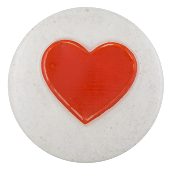
Raised red heart on white background

Back Style
The Shape
The Size
Additional Information

This is one of many variations of a plain heart shape. The heart shape is a graphic symbol representing an expression of love. The use of the heart shape originated in the Middle Ages, though it wasn’t used to symbolize love until the 15th century. Today it is frequently used on romantic items, as well as on buttons to indicate a specific love of something. 

Catalog ID IL0016

Pablove Foundation

Category
Additional Images
Sub Categories
Text on Button P (heart)
Image Description

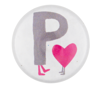
Grey text with little pink feet below and pink heart with little grey feet on a white background

Back Style
The Shape
The Size
Additional Information

This button shows the logo for the Pablove Foundation. It is part of the "awareness kit" given to individuals who donate to the foundation. The awareness kit includes a temporary tattoo, the button, a sticker and a campaign to-do list.

The Pablove Foundation has the mission to fund pediatric cancer research and advances in treatment, educate and empower cancer families, and improve the quality of life for children living with cancer through hospital play, music and arts programs.

Catalog ID CA0543

I Love My Funeral Director

Category
Additional Images
Sub Categories
Text on Button I ♥ MY FUNERAL DIRECTOR
Image Description

Black text red heart/black outline on white background

Curl Text We really do love funeral directors. http://www.atneed.com NFDA 2009
Back Style
The Shape
The Size
Year / Decade Made
Additional Information

This is a variation of the I heart NY logo that was created in 1977 by Milton Glaser for an ad campaign created by advertising agency Wells Rich Greene. The marketing campaign was sought by then-Deputy Commissioner William S. Doyle to increase tourism in the state of New York. The campaign was a wild success. The original sketch of the logo is permanently on display at the MOMA.

The logo has become iconic in pop-culture and has been imitated in many forms around the world.

Have info on this button? Contact us here.

Catalog ID IL0005

I Luv You Beary Much

Category
Additional Images
Sub Categories
Text on Button I LUV YOU BEARY MUCH
Image Description

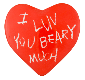
Heart-shaped pin, white-chalk handwritten text on red background

Back Style
The Shape
The Size
Additional Information

The text on the button "I luv you beary much" is a play on the pronunciation of the word "very." The spelling of "love" as "luv" is an eye dialect, the use of nonstandard spelling for speech to contrast standard pronunciation, sometimes done ironically. 

Catalog ID IL0009

Support Mental Health Or I'll Kill You

Category
Additional Images
Sub Categories
Text on Button Support Mental Health or I'll KILL YOU
Image Description

Red text on white background.

Back Style
The Shape
The Size
Additional Information

Doris Weatherford claims that these buttons were created by George Sheldon, aide to Florida Governor Reuben Askew. They were created in the 1970s in relation to the reforms that were going on.

Catalog ID HU0016

Official Spelling Champ

Category
Additional Images
Sub Categories
Text on Button OFFISHAL SPELING CHAMP
Image Description

Yellow text on black and red crest-like symbol with white trim on blue background.

The Shape
The Size
Additional Information

The English Spelling Society (TESS) states that English spelling is “probably the most irregular of all alphabetic systems” because you can’t always tell how to spell a word from hearing it and you can’t always be sure how to say a word by the way it’s written. For example: there, there, thare, their (Bell, 2011).

Poor spelling prevents people from “becoming competent readers or spellers, with devastating effects on their lives.”  It “reduce[s] their employment prospects and exclude[s] them from the mainstream of life.”  According to TESS, “learning to read and write English would be much easier and less time-consuming if its spelling were more consistent, but people are either not aware of it or choose to ignore it” (English Spelling Society). 

With the invention of text messaging, we may be doomed. That’s just Gr8.  

Sources

Bell, M. (March 2011). A brief history of English spelling. Retrieved from http://www.spellingsociety.org/spelling/history

The English Spelling Society (n.d.) Retrieved January 26, 2013 from, http://www.spellingsociety.org/

Catalog ID HU0004

Preppies Are Turkeys

Category
Additional Images
Sub Categories
Text on Button PREPPIES ARE TURKEYS
Image Description

Illustration of alligator or crocodile wearing pink shirt and blue sneakers looking in mirror at image of turkey wearing same outfit. White text on black background.

Back Style
The Shape
The Size
Additional Information

LaCoste Crocodile or Izod Alligator? Either way, this illustration pokes fun at the preppy subculture. Merriam -Webster defines preppy as “a student at or a graduate of a preparatory school” as well as “relating to or being a style of dress characterized especially by classic clothing and neat appearance.” This same dictionary defines turkey as not just a gallinaceous bird, but also, “failure, flop; especially : a theatrical production that has failed,” “three successive strikes in bowling,” and “a stupid, foolish, or inept person.”

Sources

preppy. 2013. In Merriam-Webster.com. Retrieved January 24, 2013 from, http://www.merriam-webster.com/dictionary/preppy
turkey. 2013. In Merriam-Webster.com. Retrieved January 24, 2013 from, http://www.merriam-webster.com/dictionary/turkey

Catalog ID HU0002

Thou Shalt Not Hassle

Category
Additional Images
Text on Button Thou shalt not hassle.
Image Description

Black Gothic text on white background.

Back Style
The Shape
The Size
Additional Information

The phrase, “thou shalt not hassle,” came into the popular American lexicon somewhere between the 1960s and 1980s. It is often presented as an additional biblical commandment, sometimes noted as the 11th, 12th or 13th commandment. This is exemplified in a print poster housed by the Library of Congress that states, “The 12th Commandment Thou shalt not hassle.” This poster was gifted to the LOC by Gary Yanker, a collector of political and social propaganda and agitation posters.

The visualization of the slogan “thou shalt not hassle” with a bold, gothic font has been embraced and proliferated by the clothing brand Heavy. Heavy Clothing grew out of Zac Doom’s Blogspot that was started in 2009. Heavy has strong ties to biker culture, and frequently imposes the phrase over images that could be considered provocative, such as police officers admonishing bikers, mug shots, marijuana etc.

Sources

Heavy [@heavyclothing]. (n.d.) Posts [Instagram profile]. Retrieved September 18, 2020, from https://www.instagram.com/heavyclothing/.

Library of Congress. (n.d.) Posters: Yanker Poster Collection. Retrieved September 18, 2020, from https://www.loc.gov/pictures/collection/yan/.

Library of Congress. (n.d.). The 12th Commandment Thou shalt not hassle. Retrieved September 18, 2020, from http://www.loc.gov/pictures/item/2015648067/.

Show Class Mag (Producer). (2017). HEAVY Clothing’s very own Zac DOOM [Youtube video]. Retrieved September 18, 2020, from https://www.youtube.com/watch?v=aqyJYWQG3I0.

Catalog ID HU0013